Introduction
The Apple App Store is used by millions of people to get apps for their phones. I found that the current App Store was not doing enough to help users find apps that would meet their needs and fit their life style. I redesigned the app to make it look and feel more like an online shopping experience because the App Store is selling a product. The new version has several features that will help users find the best apps to enhance their life.
Challenge
The challenge was redesigning the Apple App Store in a way that would behave more like an online store, and aid the user in finding apps that best fit their lives.
Solution
Add questions during onboarding that ask for the user’s location and interests and have three different methods for browsing and searching, accessible on the main navigation.
Wireframing/ layout
When making the wireframe for the app, I considered how other online stores are laid out. I carried these ideas over into my design to make the browsing experience easier.

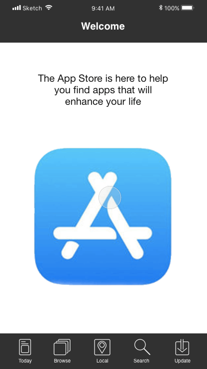
Onboarding
I’ve added an onboarding section to the beginning of the app where users can choose their interests and add their location. This creates a recommendation screen that is tailored to the user’s needs, location, and interests, making it a personalized shopping experience.
Browse by Category
Now a user can browse apps by categories, and have a similar experience to visiting an online store such as Amazon. Once a main category has been chosen there are sub categories to help the user find the app that best fits their needs. This creates a deeper information architecture that allows for precise browsing.

App Profile
While looking at the original app design, I noticed that the user has to scroll a lot to see all the information about the app. I consolidated this information by providing a navigation bar and giving the user the ability to choose which details they want to read, reducing the amount of scrolling at the same time.

Browse by Location
The second option for browsing allows the users to look for apps that are relevant to their location. For example, apps for museums or services offered in that city, making it a useful feature for people who just moved to a city or tourists. The map shows what physical businesses have apps and the location, helping tourist get more oriented with the geography of the city.

The Info Architecture of the Search
I did not really change the look of the search screen too much, however the information architecture of the original one could be improved. It seems the actual App Store’s search is not very in-depth. The architecture can be improved by having app developers give their products specific tags and having the search capability recognize more keywords.

User Interface
The original app had a bland interface considering it’s a store selling a product, so I redesigned the user interface to match the elegant modern design that can be found on the Apple website. The new interface is clearly defined with blocks of color and line. I also redesigned the main navigation icons and made my own icons from scratch to match the streamline icons on the Apple website.
